Phew
Client
Phew
Location
UK
Year
2026
Info
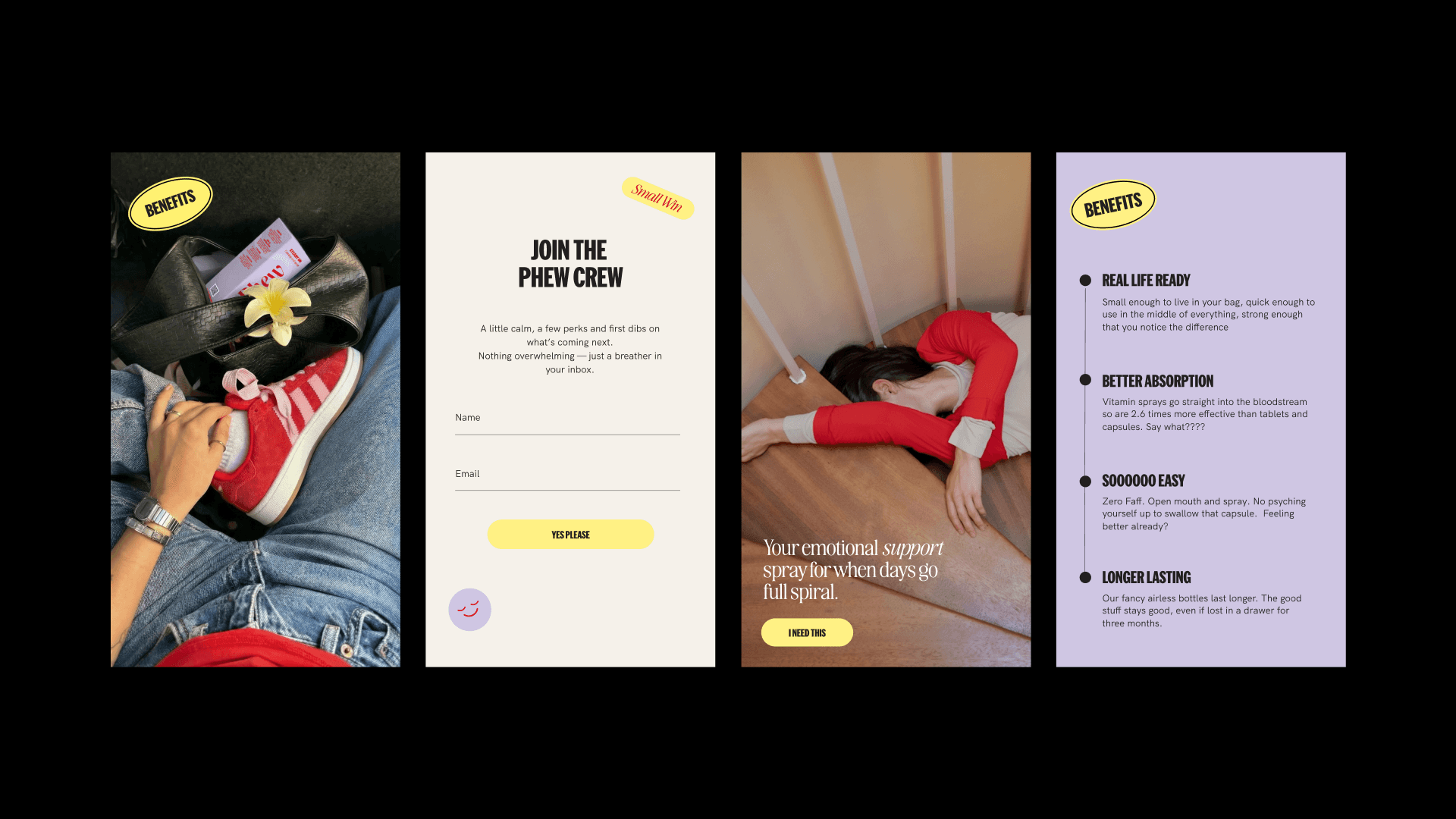
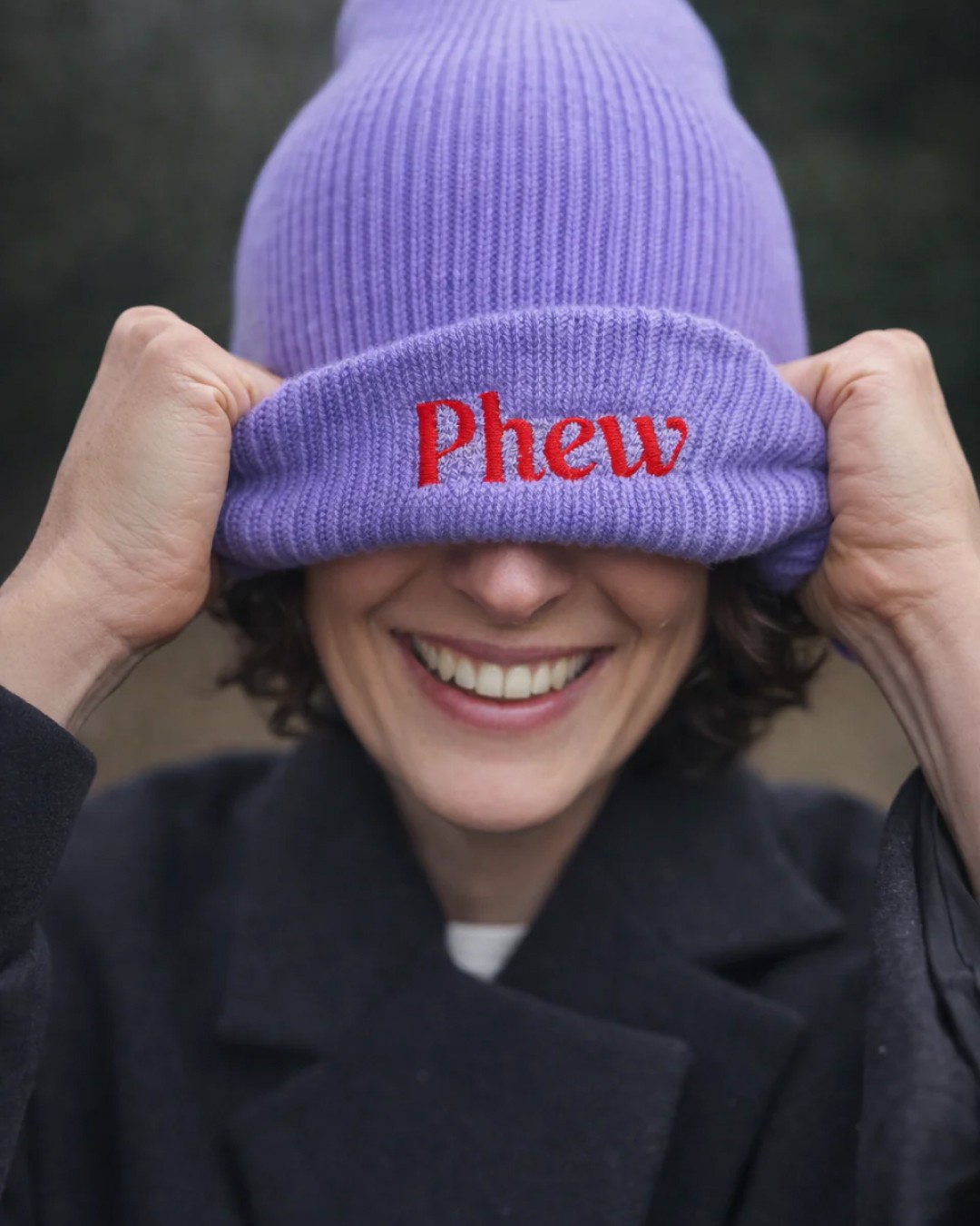
Phew started with a clear idea. A modern oral spray brand designed to support stress, sleep, energy and immunity in a way that actually fits into real life. Created by two sisters who wanted to build something together, the intention was never to add another overwhelming wellness routine, but to offer something simpler and more considered.
From the outset, the opportunity was clear. The supplement space is crowded, with brands that often feel clinical, overly polished or disconnected from how people actually live. A lot of time was spent understanding what already existed, and much of it looked and felt the same. That became the starting point. Rather than following those conventions, the focus shifted to positioning Phew as something more human, grounded and relevant. The spray format played a key role in this, offering a quick, practical alternative that removes friction rather than adding to it.
Once the positioning was defined, everything else followed with clarity. The strategy shaped the identity, the packaging and the digital experience, ensuring every touchpoint felt aligned. The visual direction brought personality and confidence, balancing boldness with ease, while the website was designed to feel clear, engaging and product-focused in a competitive space. The result is a brand that feels distinct, not just in how it looks, but in how it shows up and connects.